A Cherry-Picker’s Guide to Temperature Trends Update: Warming Crisis Not
By Chip Knappenberger -- February 7, 2011Back in October 2009, my post “A Cherry-Picker’s Guide to Temperature Trends” examined the many different statements that could be made to describe the tendencies of global temperatures over the past 20 years. I concluded that anything from rapid cooling to a faster than expected warming could be supported by carefully picking through the available data.
Now, more than a year later, and after one of the “warmest years on record,” I’ve updated my analysis so that any new statements characterizing global temperature can be evaluated against the complete set of recent observations.
In general, I find that statements such as “global warming has stopped” should be tempered, at least for the time being. But I conclude that my original article’s summary remains more or less* applicable:
What I can say for certain, is that the recent behavior of global temperatures demonstrates that global warming is occurring at a much slower rate than that projected by the ensemble of climate models, and that global warming is most definitely not accelerating.
I say “more or less” because one could argue from the data (as we’ll see below) that the warming rate during recent years has upticked with the warmth in 2010 indicating a warming that is occurring faster than projected and is accelerating. But, I think that this represents a temporary condition.
In due course (say over the next several months), the warmth in 2010 will continue to subside as the cooling influence from a Pacific La Niña event supplants the warming influence of last year’s El Niño (see here for example). This will have the effect of flattening out recent temperature trends and returning them once again to lower-than-projected values. I imagine that we’ll see such an impact when it comes time again for me to produce an update to this update.
But until that time, I’ll describe the situation as it presents itself data available through December 2010.
The Story through 2010
Much of the following text is repeated from my original article, updated where required.
Accusations of cherry-picking—that is, carefully choosing data to support a particular point—are constantly being hurled around by all sides of the climate change debate. Commonly, accusations of cherry-picking are levied at analyses describing the recent behavior of global average temperature. Primarily, because claims about what the temperature record says run the gamut from accelerating warming to rapid cooling and everything in between—depending on who you ask and what point they are trying to make
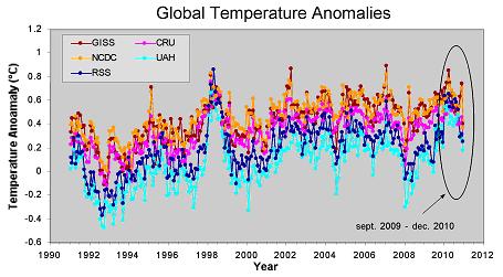
Figure 1 illustrates the various cherry varieties that you have to choose from when trying to fashion your own interpretation of the recent behavior of global temperatures. It shows the global temperature history during the past 20 years as compiled in five different datasets (three representing surface temperatures, and two representing the temperatures in the lower atmosphere as measured by satellites—the latter being relatively immune from the data handling issues which plague the surface records).
Figure 1. Global temperature anomalies from January 1991 through December 2010 as contained in five different data compilations. The GISS (Goddard Institute for Space Studies), NCDC (National Climate Data Center), and CRU (Climate Research Unit) data are all compiled from surface records, while the RSS (Remote Sensing Systems) and UAH (University of Alabama-Huntsville) data are compiled from satellite observations of the lower atmosphere. The circled portion is the new data added since my original article.
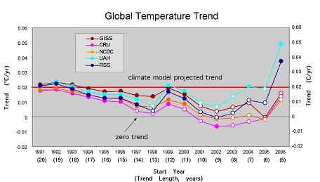
To give you some guidance as to which cherries to use to make which ever point you want, I have constructed a Cherry-Pickers Guide to Global Temperatures (Figure 2).
Figure 2. Cherry-Pickers Guide to Global Temperatures. Each point on the chart represents the trend beginning in September of the year indicated along the x-axis and ending in December 2010. The trends which are statistically significant (p<0.05) are indicated by filled circles. The zero line (no trend) is indicated by the thin black horizontal line, and the climate model average projected trend is indicated by the thick red horizontal line.
It shows the current value (though December 2010) of trends of various lengths from all of the five commonly used global temperature compilations. I compute the trends as simple linear least squares fits through the monthly global average temperature anomalies for each dataset (from Figure 1). Each point on the Figure 2 (for each dataset) represents the trend value for a different length period, beginning in January of the year indicated along the horizontal axis and ending in December 2010. Starting in January of particular year and ending in December of last year produces a trend with a length expressed in units of whole years. For example, a trend starting in January 1999 and ending in December 2010 include 120 months, or 10 complete years. The values for the 10-yr trend for each dataset are plotted on the chart directly above the value on the horizontal axis labeled 1999. If the trend value is statistically significant at the 1 in 20 level (p<0.05; note that I am not taking into account autocorrelation), I indicate that by filling in the appropriate marker on the chart.
I also include several other items of potential interest to the cherry harvesters; first is the dotted horizontal line representing a trend of zero—i.e., no change in global temperature, and second, the thick red horizontal lines which generally indicates the average trend projected to be occurring by the ensemble of climate models. Bear in mind that red line only represents the average model expectation, not the range of model variability. So it shouldn’t be used to rule out whether or not a particular observed value is consistent with model expectations, but does give you some guidance as to just how far from the average model expectation the current trend lies (a cherry picker is not usually worried about the finer details of the former, but, instead, the coarser picture presented by the latter).
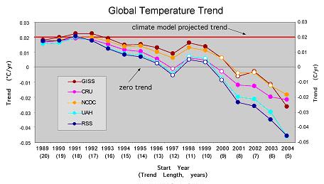
For comparison to my original analysis, I include the figure below (Figure 3) which is what the trends (in Figure 2) looked like with data ending in August 2010 2009.
Figure 3. Same as Figure 2, except with data beginning in September of the year indicated along the x-axis and ending in August 2009.
Notice that in general, the trends ending in December 2010 (in Figure 2) are more positive (or less negative) for all trend lengths, with the biggest changes occurring for the shorter length trends. Instead of indicating rapid cooling, most trends shorter than 9 years in length currently indicate some degree of warming taking place. There is much less support currently for the notion that “global warming has stopped” than there was 16 months ago (although there are signs that support for such a statement is building again—note the general decline in temperatures during the last 6 months or so in Figure 1).
Now and Then
Here is a comparison of some general statements I made in October 2009 verses how the situation presents itself today.
Old Statement: For the past 8 years (96 months), no global warming is indicated by any of the five datasets.
New Statement: During the past 9 years most datasets indicate some degree of global warming taking place. The data from the Hadley Center is perhaps an exception to this general statement (although the Hadley Center dataset may include a cooling bias).
Old Statement: For the past 5 years (60 months), there is a statistically significant global cooling in all datasets.
New Statement: For the past 5 years (60 months), there is statistically significant global warming in the two satellite datasets, the surface datasets indicate a non-significant warming trend.
Old Statement: For the past 15 years, global warming has been occurring at a rate that is below the average climate model expected warming.
New Statement: For most of the past 17 years, global warming has been occurring at a rate that is below the average climate model expected warming.
The last statement—which is the same now as it was then, is arguably the most important. Despite a record (or near record, depending on who you ask) high for global temperatures in 2010, the general rate of warming over the past decade and half (going on two decades) is generally less than it was expected to be.
This bodes well for the earth’s environment and its denizens from polar bears to human beings.
Let’s hope that it continues (and there are plenty of reasons why it may).
Be sure to stay tuned for further updates!
*[Editor’s note: the phrase “more or less” was dropped in the editing process and did not appear in the original post, but was properly re-inserted on 01/25/12 after comments by Tamino]


I appreciate the Jackson Pollock-like quality of multi-colored graphs showing temperature trend lines. A bit more colors and textures would rival Pollack’s Lavender Mist. Although I enjoy the idea of a cherry picker’s guide to global temperatures, I still have the feeling that Hayak’s scientism hovers nearby. Not because I wish to disparage the effort here (quite the contrary, since I believe Chip Knappenberger does valuable work) but rather because the issue of climate is so incredibly complex and complicated. It is inconceivable to me we have sufficient knowledge of the vastly intricate and entangled variables involved, starting with a firm sense of reliable baseline temperatures, that accurate conclusions can be drawn about climate behavior or the meaning of temperature trends , either in a prescriptive or descriptive sense.
Chip’s analysis here will do little to quell bias that would have the data confirming belief that humans are responsible for creating a precipitous hell on earth. For example, here’s what The New Yorker’s Hendrik Hertzberg wrote last week, obviously referring to the same datasets used by Knappenberger, to spur the Obama Administration onward in its battle against the forces of Global Warming:
“Meanwhile, the ‘overwhelming scientific evidence’ that Obama used to cite (in his state of the union address) continues to mount, relentlessly and ominously. The decade just ended was the warmest since systematic recordkeeping began, in 18800; the year just ended was tied (with 2005) for the warmest on record, and it was the wettest. The vast energies released by moister air and warmer oceans are driving weather to extremes. Hence epic blizzards as well as murderous heat waves, unprecedented droughts, alongside disastrous floods, coral reefs, bleached white and lifeless while ice caps recede and glaciers melt.”
Scientism amuck in catabolic hyperbole. Such end-of-world rhetoric nicely complements the Biblical passages in Revelation 8: 8-13. I’ll just quote a few verses–to give the gist: “Then the second angel sounded: And something like a great mountain burning with fire was thrown into the sea, and a third of the sea became blood. And a third of the living creatures in the sea died, and a third of the ships were destroyed. Then the third angel sounded: And a great star fell from heaven, burning like a torch, and it fell on a third of the rivers and on the springs of water. The name of the star is Wormwood, and many men died from the water because it was made bitter.”
Is it any wonder that such beliefs inspire climate jihad? How awful it must be for the likes of Hertzberg to see Obama shrink back from worldwide cap and trade measures and instead promote mandates for renewables–knowing as he does that unless something drastic is done, the world must suffer terrible destruction?!
Using incomplete knowledge to promote ideological/political agendas has been a lodestar for hucksterism for millennia. The more things change, the more they stay the same.
I’m still trying to find the standard method for measureing the global temperature. NIST does not have any such standard so I can only conclude that all supposed measurements of global temperature are guesses. Years ago I was working on a project where we had to take the outside wet and dry bulb thermometer temperature every four hours. They wanted the temperatures to a tenth of a degree so we recorded the temperatures to a tenth of a degree but it was just a guess. This makes me very suspicious of thess global temperatures given to a tenth of a degree.
[…] by Chip Knappenberger at Master Resource […]
Does the recent uptick in UAH and RSS reflect a specific region, i.e. the Arctic, or is it a global change?
Doug,
You can find the 2010 anomaly map for the UAH lower troposphere here.
I’ll let you decide how to describe it!
-Chip
If we look at temperature trends in the US since 1998, we are looking at a cooling trend of -9.6 deg F per century!
http://thetruthpeddler.wordpress.com/2011/02/08/official-government-data-confirms-that-us-is-cooling-at-a-rate-of-over-17-deg-ccentury-since-1998/
Got here from WUWT. Good stuff, that I must study. However, whether or not the world is warming is only the first question? We then have what are the causes, is it linear or cycles of various lengths or chaotic, and if it gets warmer, does it matter?
So far I’m unsure anyone knows with enough certainty to justify the policies being inflicted.
The assumption about no autocorrelation is key to the statements of statistical signficance. A more sophisticated statistical analysis that took autocorrelation into account would almost certainly indicate non signficance for all of the short term trends. Stated somewhat differently, the values for sequential months are not independent of each other, and this invalidates the standard statistical analysis of OLS.
Figure 3 shows, “data ending in August 2010.” I think that should be 2009?
[Right! Fixed. Thanks. -Chip]
Here is a sample of a longer term outlook on temperature (HadCRUT3gl) using 3 different methods: MOV, 2-Pole “filtfilt” Chebushev & a Fourier Convolution. The time frame was a 10 year MOV, and a 0.1 cycles/year filter cut-off freq.
http://www.imagenerd.com/uploads/filter_er_10yr-g6l8y.jpg
The three methods were used as a comparison between the methods, and to evaluate their strengths & weaknesses. The MOV “cuts out” before the end, which is not helpful, and the “filtfilt”, or forward & reverse recursive is subject to “reflection” conditions at the end. The Fourier does seem to give the best result, particularly at the end point.
The upper figure shows the three filter methods, and their respective responses. The bottom figure is a little more interesting, in that it shows the difference between the Fourier Convolution filter response and the “raw” signal. Of more importance, it provides a metric to evaluate the filtered value error from the actual. It shows the difference is pretty much less then +/- 0.2 deg. over all, while the mean is virtually negligible. Assuming a Gaussian distribution, the 3 sigma error would be less then 0.3 deg. Probably better then most of the temperature data taken over the past 150 years.
Chip, what I’d find really interesting here is to see a 3-axis plot with the start and the end years as the two independent variables (and the temperature trend as the dependent variable). There would have to be one graph per dataset, but it would really give a feel of how extreme the results can be if properly cherry picked.
Isn’t the expected 21st century temp increase spouted by IPCC and other warmists between 2-7 C, with a 4 C being the highest probability? And, even if the highest probability is 2 c, where is the harm in that? Since the 15 yr trend is 1 C per century, and satellite trend for 30 years is about 1.5 C per century, can someone tell me what the problem is?
Just stumbled upon this, wonder if it’s been updated for 2011, and would like to suggest addition of atmospheric CO2 levels. Near as I can tell the hypothesis that CO2 is a climate driver has yet to be proved experimentally. In fact, average global temperatures have been has been more-or-less static for a decade-and-a-half in the face of exponentially rising CO2 levels.